Cool tricks to boost your photos
Photoshop is a dauntingly complex program. This makes tips and tricks very welcome while discovering, exploring and hopefully understanding new functions. Enhance your portraits and landscapes, change the mood of light and find ever more effective ways to use all those tools at hand.
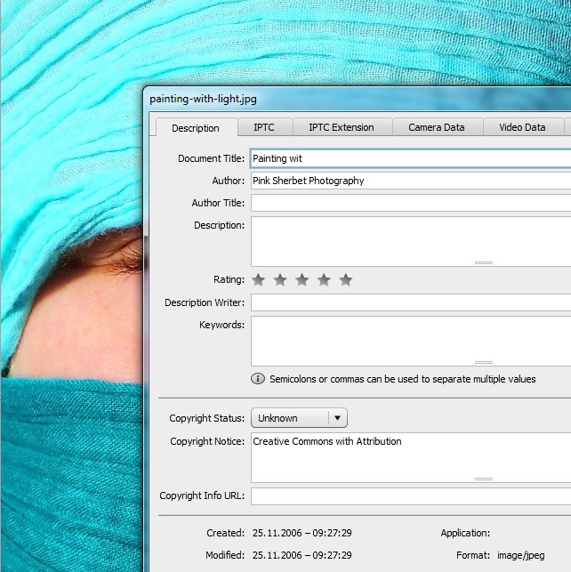
01 Painting with light
First, open a photo you think could use a bit more light and shadow. Then press Shift+Ctrl+N to create a new layer and call it “light” or something more creative if you wish. The mode of this layer you change to Overlay. Also activate the radio button for “Fill with Overlay-neutral color (50% grey)”.

Pink Sherbet Photography / http://www.flickr.com/photos/40645538@N00/305742748
Activate the Dodge tool and set the exposure to about 25% to paint some light into your image. To create or intensify shadows you use the Burn tool. By selecting highlights, midtones or shadows you can influence which range of light is affected by your painting. Skintones like in this picture are usually midtones. Using both tools on this separate layer allows you to precisely control the lighting situation of your photography.
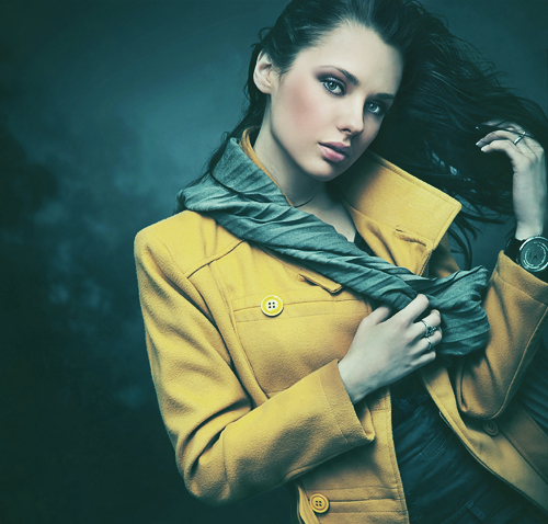
02 Fashion-Look
Create a new adjustment layer: Layer > New Adjustment Layer > Color Balance. With the tone Shadows selected you set Green to +20. The Midtones you set to Cyan -40 and Blue +25. Highlights should then be pitched towards Yellow, Magenta and Cyan, depending on the basic image.
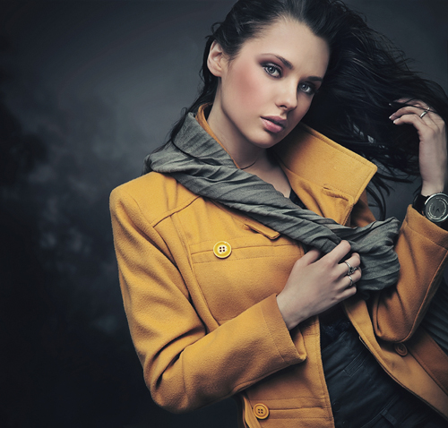
Portrait of young lady / © konradbak / #22627572 / http://de.fotolia.com/id/22627572
Now create another Adjustment Layer > Brightness/Contrast which you set to Brightness 20 and Contrast 60. Fill a new empty layer (Shift+Ctrl+N) with the color #55ccdd (RGB 85,204,221) and reduce the opacity of the layer to around 10%.
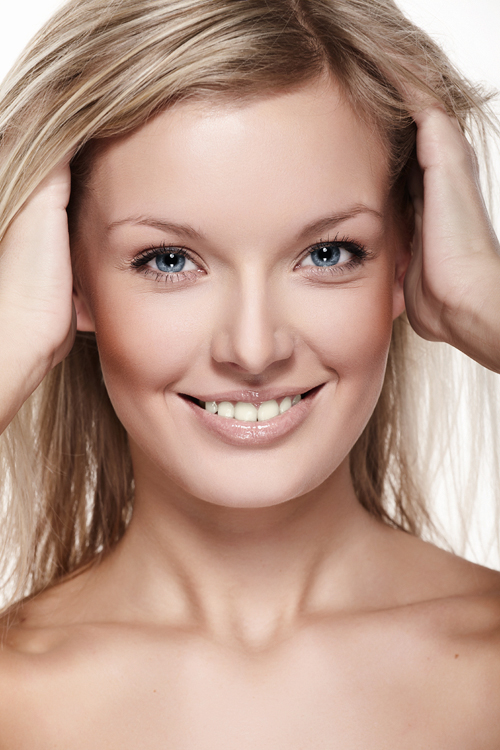
03 Optimize your lasso toss
For complicated selections some users prefer the Lasso tool over paths. If you are among those and wish you had those straight Polygonal Lasso lines at hand for a part of your selection, simply press ALT while drawing your lasso. Release it (keep the left mouse button pressed when you do that!) to regain your freehand freedom.

fashionable lady / © konradbak / #24291604 / http://de.fotolia.com/id/24291604
By the way: When you work in high zoom levels it can easily happen that you reach the edge of the working area while laying down your selection. In this case keep the SPACE bar pressed to move around the work area with the Hand tool.
Heavy users of the Selection tool may also be familiar with the following problem: While creating the selection you made one click too many and the whole selection is gone against your intention. This keyboard shortcut should help: Press SHIFT+CTRL+D and the “ants” will be running again.
04 Symmetric Transformation
Select Edit > Free transformation in the menu bar or simply press CTRL+T to gain full transformational control of the content of a layer. That isn’t exactly news. Yet, if you also press ALT while tweaking your form, opposed anchor points will relate to one another in a mirror inverted way. This can be quite handy if symmetry of sorts is what you are looking for.

back 1 / © olly / #5981420 / http://de.fotolia.com/id/5981420
If you also bring CTRL into play (CTRL+ALT) diagonally opposed anchors relate to one another. Press SHIFT+ALT to scale the form proportionally in relation to the center. This can be extended to SHIFT+CTRL+ALT for parallel perspective transformation. Don’t know what that is? Simply open Photoshop, put a rectangle shape in a new image and start playing.
Important: This little aim you see in the middle of a form during a transformation isn’t only there to look pretty. It defines the “center point” or anchor of the form and thus influences symmetry. Once again: Try it yourself and move it around while doing all the tricks above to get the hang of it.
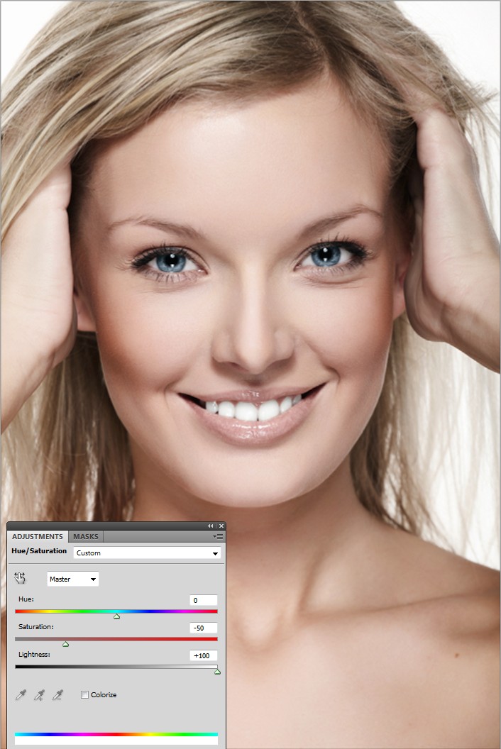
05 Bleeching Teeth
Almost no one has gleaming white teeth – not even those super models. With Photoshop you can easily brighten up those yellowish chewing tools. Activate a new Adjustment Layer > Hue/Saturation via the Layer Menu in the top navigation and select the Yellows from the drop down in the dialogue window. This range limitation makes it easier to apply your changes to the teeth area.
Pure beauty / © Maksim Toome / #29785763 / http://de.fotolia.com/id/29785763
Now you reduce Saturation and increase Brightness to the maximum. If this isn’t enough also reduce saturation and increase brightness for the reds until it looks nice. At this point you bleeched the whole image. To change that first click the mask miniature of the layer and invert it by pressing CTRL+I or going through the menu: Image > Adjustments > Invert. With the pencil tool set to white and moderate opacity you can now selectively “paint in” the effect only where you want it.
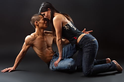
06 Sharpen with High Pass
This is a classic you should definitely learn. Instead of using Unsharp Mask or other sharpen tools you can also apply the High Pass filter for a similar effect. Copy your base layer with CTRL+J and activate Filter > Other > High Pass. In the dialogue window you set the radius to 0.1, which should turn the image almost uniformly grey.
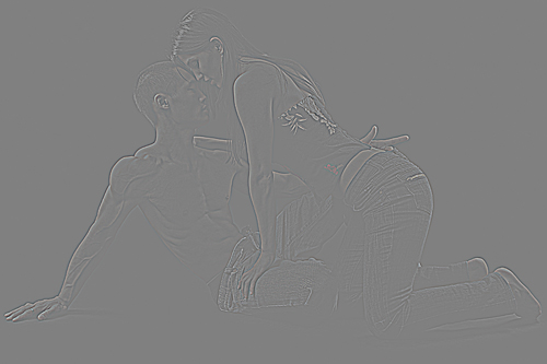
Fashion Couple / © Gabi Moisa / #5793164 / http://de.fotolia.com/id/5793164
Now slide the controller right until you see the outlines again. Consider: The stronger the outlines, the stronger the sharpen effect. As you see in a moment it’s advisable to go a bit over the top to avoid having to redo everything. Set the blend mode of the layer to Soft Light and simply reduce layer opacity if you indeed overdid the effect.
07 Fix tints in the white of the eye
If the white of the eye contains an annoying color tint (no, not the red eye effect) you can easily fix that. Create an Adjustment Layer > Black & White. As we did for the teeth earlier you select the layer mask and invert it with CTRL+I. Take a small brush and paint the eye white with white. Reduce the layer opacity to get a more natural looking result.
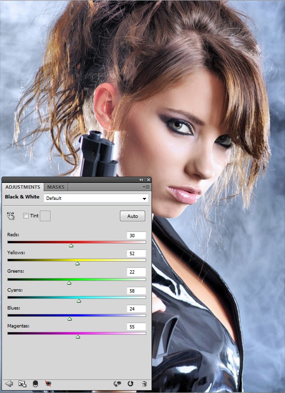
beautiful sexy girl / © T.Tulic / #14162244 / http://de.fotolia.com/id/14162244
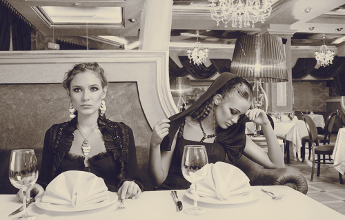
08 Double tint
Combining two gradients can yield great looking discoloration effects. Create two gradients with Layer > New Adjustment Layer > Gradient Map. To set the colors for the top (in the layer palette) gradient you click the gradient icon of the layer.
In the editing dialogue you set a very dark brown for the left color stop (the bottom controller) and white for the right. The second, lower, gradient layer you set up with a dark blue to beige gradient. Now double click the upper gradient layer to access the Blending Options.
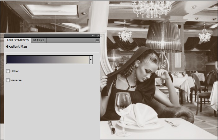
Dining Beauties / © Dmitry Fisher / #11752898 / http://de.fotolia.com/id/11752898
In the Blend If area you set the controllers of the This Layer: gradient. ALT+Click the left stop and move the resulting half stops so that you get 40 / 90. Do the same for the right stop with 160 / 240. This causes the lower gradient to softly shine through in the lights and shadows, which can make for a great effect.
09 Copyright-Status
You now learned a lot of tricks to make making art easier. But it still isn’t easy to protect your artwork. One way to get there is to use the File Info option provided by Photoshop. Go to File > File Info or press ALT+SHIFT+CTRL+I for the dialogue. In the description pane you can now select Copyrighted as Copyright Status. While this won’t help against the really bad boys it makes it easier to prove that this is actually yours when you also provided author information and such.
metall textur / © Sebastian Kaulitzki / #5796645 / http://de.fotolia.com/id/5796645
10 Manage colors
Quite often foreground- and background color in the toolbar are changed by grabbing a color from an open document with the Eyedropper Tool. A likely workflow: You first define the foreground color and exchange this with the background color (shortcut x) to grab the next color with the eyedropper. It works but it’s not exactly elegant, isn’t it?
Sit and learn: Exchange the foreground color as usual but instead of switching simply press ALT while using the eyedropper. You now apply it to the background color. Neat!
—————————————————————————————————-
All these tips and tricks are not iron bound to the specific values provided in some cases. Those are only for orientation and were used to achieve the effect in the example images. About the only general rule we ask you to adhere to is:
Try around and have fun!
Got tips, cheats, hacks and shortcuts of your own? The community would surely love to read about those in the comments!