Become a great writer!
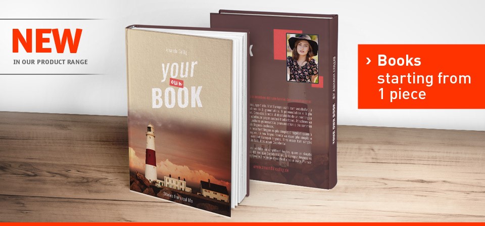
If you’re willing to conquer your readers with some high-quality printed books then search no further! We are now proposing you to create your own book, from start to finish! Here are the options we are offering:
- Hardcover either with a rounded or straight back, printable on the two outside covers of the books.
- Softcover printable on both the outside and inside covers of the book.
Paper is a 250 gsm art paper glossy. - 50-996 content pages.
- Starting from 1 copy.
- Refining Options: Blind embossing, Lamination (Cellophane Coating), hot foil flat embossing,
hot foil relief embossing, UV varnish (+ Blind embossing, hot foil flat embossing or hot foil relief embossing).
Our books are also available in many formats and can be great not only for writers but for company willing to introduce their business in an elegant and professional way!
Now you know more about what we have to offer, let’s start with the tutorial!
The front cover:
Let’s just imagine we wrote a crime novel. What we will need now are some elements revolving around this theme to give our potential readers a good idea of what the book is about.
Here are the pictures we used:


As for the font, you can find it here: Traveling Typewriter Font.
First of all, we set up the size of our front cover:

Click image for full size
Important tip: Don’t forget to put 300 dpi as this is the quality you will need for your design to be perfectly printed.
After that, open your grunge background image. Right click on its title and then on “move to a new window” to be able to transfer it onto your main front cover file.
Once this grunge background image is on your main file, press ctrl+T to resize your picture and put it the way that fits the most.

Click image for full size
This is what we got:

Click image for full size
Now let’s open the picture with the “Do not cross” lines. Repeat the same operation as you did for the grunge background picture and paste it onto your main file. Ctrl+T in order to resize and place the picture the way you want it.
To create a nice blending effect with the background, we decided to use some layer’s properties. On your right, click on the “Do not cross” layer and select “Multiply” right next to “opacity”. This should create this great effect:

Click image for full size
Now we’re going for our second element of the front cover: the handprint.
Once you opened the picture we advise you to erase the white corners and lines of it so it doesn’t show at any time during the process. Like for the picture from before, we decided to use the layers. Select your handprint layer and change from “normal” to “multiply”.
Press Ctrl+T to resize it and rotate it a bit so that it gives the impression some red-handed criminal pressed it on the wall.

Click image for full size
To create the red color, select the layer where your handprint is and click on “image” in the upper bar of photoshop and then “color balance”.
As you can see we pushed the red, the magenta and the yellow levels nearly at their maximum:

Click image for full size
With this, you’re guaranteed to obtain a really bright red which is closer to the blood red colour since our layer is on the “multiply” option.
If you like it that way, leave it like it is! For us, we’re gonna push the bright red side of it a little bit further. And to do so, we’re gonna click on “image” as we did before and then “vibrance”.
As you can see, we’re really pushing the “vibrance” and “saturation” levels to their maximum too:

Click image for full size
We now have the base of our background (we just moved the pictures a little bit to create a better effect):

Click image for full size
Now let’s go for the text.
You can choose any font you like. We are going to keep the same both for the title and the author’s name but you don’t have to do that if you don’t want to.
Important tip: Don’t forget the 2mm bleed on the edge of your picture! If you put a part of text too close to the edge, this one might be cut off during the printing process.
To do so, click on the “T” icon in your toolbar. After that, select the font, the size and write inside the rectangular space in your picture. We decided to go for a size between 50 to 60 pts for our title to be visible.

Click image for full size
It’s time to put the author’s name. It is always after the title and it’s a little bit smaller. Repeat the same operation but this time select a size between 26 and 30 pts. We decided to place it on one of the “Do not Cross” lines for a better effect!
And here is the final result:

Click image for full size
The back cover and the spine:
To create our back cover we will be using the front cover’s background.
First, click on the “eye” icon next to your text and handprint layers. This will mask them for a little bit while you will be focusing on the picture. This is what we did here, moving the background a bit, getting rid of the hand print, but not touching the lines as we want them to be consistent with the overall picture.
Here’s our result:

Click image for full size
Select your title layer, uncheck the “eye” icon for it to be visible. Drag your title to the top of the picture. We recommend to use a 30 pts size for the title as it shouldn’t be as big as it is on the front cover.

Click image for full size
Same thing for the author’s name, still keeping in mind it is underneath the title and smaller.

Click image for full size
Now we have a lot of space for the summary. However, we wouldn’t advise you to take the whole space for it. First of all, this is a summary and people might get quickly tired if the text is too long. Second, because you might be using a bar code with an ISBN to reference your book and this needs to be put at the bottom of your back cover. Each country has its own ISBN system and therefore website. You will find them easily on the Internet.
And, last but not least, choose a very easy and readable font. Something along Arial, Times New Roman or even courier (if you have to) as your text will be obviously smaller than your title and author’s name.
Clicking on the “T” icon in your tool bar, start creating a wide rectangle so you can write your summary in it. For the size, we recommend something between 10 to 14 pts, depending on the font you chose. We went for the Times New Roman one and for a size 14.

Click image for full size
Do not hesitate to resize and reframe your rectangle the best way possible. A good tip to make sure it looks professional is to match the beginning and the end of your title with the beginning and end of some sentences in your summary. Like in the picture:

Click image for full size
And this would be our final result:

Click image for full size
We will now create the spine of our book. To do so, please refer yourself to the beginning of the back cover section as you will need to use its base.

Click image for full size
As you can see, we got rid of title, author’s name and summary.
Now, click on “layer” and then “merge visible”. This will merge the “do not cross” and “background” pictures together as you will have to get rid of the text layers yourself.

Click image for full size
That done, create a new file for your spine. The width of it will depend on how many content pages you have so be sure to calculate it first before entering any width information into photoshop. For us we choose to go for 750×2280 pixels with 300 dpi of course.
Like before, right-click on the background document title, click on “Move to new window” and transfer this picture onto your new spine file.
Click on the “T” for the text. To rotate it, simply grab one of the rectangle’s corners and slowly move it until you reach 90 degrees (roughly). Proceed the same way for the author’s name.
Important tip: Don’t forget the title needs to be a little bit bigger compared to the author’s name. Again the latter will sit underneath the title.

Click image for full size
And this is the final result for the spine:

Click image for full size
You did it! You created the cover of your new book!
Here’s an overview of how it should look like:

Click image for full size
Crime novel is not your forte? You feel yourself more like a poetic person?
Here is our book of poems display:

Click image for full size
You’re not too keen on fiction? Why not writing a book about your last travel?

Click image for full size
We do not own some of these designs. This is just a collection for your inspiration. Our sources are as stated. If you feel like we used your design wrong, please contact us.
PA