The 7 golden tips for designing Flyers
13.04.2017, 8:13Tips for nice printing products
In this article, we have gathered comprehensively summarized tips for creating promotional flyers. Enjoy!
InDesign Tutorial: Order your Packing tapes
23.03.2016, 11:11A tutorial to help you create your own Packing tapes
In order for you to make no mistakes when ordering your Packing tapes, we’ve created a little tutorial to help you correctly create your printing data set.
Tutorial: How to create your own typographic design!
25.02.2016, 14:21Easy as ABC and 123!
They are all the rage, and so it is no wonder that we are quite frequently stumbling upon typographic posters and works of art that represent letters of the real world. Check out these tips and tricks for your next typographical creations!
The best Photoshop tutorials on the web
23.04.2015, 10:24Be creative!
Today, we wanted to show you a few tricks regarding Photoshop (and other software you can use) both in photography and design to unleash your imagination and make sure it knows no boundaries.
How to create a CD cover with an underground touch
04.02.2015, 8:21Be creative and professional!
In this tutorial, we will show you how easy it is to make CD cover designs using Adobe Illustrator. We hope that you will enjoy making it and you will be pleased with the final result.
How to make a T-shirt design in Adobe Photoshop
03.12.2014, 8:42A useful tutorial!
In this tutorial we will show you how to make a design in a simple way, in Adobe Photoshop. Follow these steps and you will be able to make your own T-shirt designs.
Images, they say, are worth a thousand words
Adobe’s Lightroom is used to manage, optimize and convert photos. It is perfect for the photographer who wants to organize and develop his shots. The biggest advantage that Lightroom has is…
30 black-and-white logos that are convincing as achromatic version
21.05.2014, 11:16The power of a good contrast
A logo must always work in its black-and-white version. The reason? Simple. So it gives a good image of your company in faxes, photocopies and printed material…
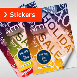
30 stickers that go beyond your imagination
30.04.2014, 10:39Conquering the world one sticker at a time!
It’s time to get a little tacky… but in a cool way because you will discover that some stickers are actually quite awesome…
Extraordinary 3D Photoshop Tutorials
16.07.2014, 11:37Yes, Photoshop!
Adobe Photoshop, the preferred choice for the world’s top 2D designers can now (and has been able for quite some time actually) achieve outstanding 3D designs. Well, not exactly…