Basic elements
The third part of our logo design feature covers basic visual elements often used in logo design. What are they, what do they mean and how are they used? The first two parts of our series were about defining logos and the different logo types we see every day.
Basic element: rectangle
Logo design makes use of some basic elements, which each convey certain messages. The rectangle for example stands for order, is robust and conservative. Squares can be used as frame, be sectioned into further rectangles or turned to appear as rhomb or diamond.
1. Square
The square is neutral and perceived as steadfast and stable. For this reason it’s often used in industries/branches where reliability is a key factor: banking, insurance, chemicals.
![]()
2. Rhomb
A square turned 90° becomes a rhomb. This change of position has quite some impact on the viewer’s perception. It appears lighter and seems more balanced.
![]()
3. Frame
Unfilled squares of serve as frame for more elements. Those might well brake through the confines of the frame.
![]()
4. Filled frame
The filled frame is a popular version of the element, where the surface of the rectangle is highlighted. You often find those with rounded corners.
![]()
Basic element: circle
The circle stands for constancy and evenness. Unfilled circles may serve as framing element. Small circles become dots, compressed circles become ellipses.
1. Circle
A circle never ends and protects. Quite often circles are associated with the sun and hus perceived as heavenly or radiating.
![]()
2. Ellipses
Ellipses are useful to frame longer words. They appear airy, spirited and enclosing.
![]()
3. Semicircle
The effect of a semicircle can vary and often depends on the visual orientation. In the so called bowl orientation our association goes along the lines willingness, openness and empathy. The tunnel orientation conveys a message of trust, reminds us of a dome or a sunset.
![]()
4. Dots
The smallest circular element is the dot. They can be used visually create larger shapes simply by their arrangement or coloring.
![]()
Basic element: Triangle
The triangle usually symbolizes a development, success and activity. Two triangles together can form a square, multiple copies of equilateral triangles a hexagon. In three dimensional perspective a triangle becomes a pyramid.
1. A- or V-shaped triangle
A triangle pointing upwards appears striving, ambitious and pointed. Pyramids or a protective roof also come to mind. A downward pointing triangle is more aggressive, warningly and provocative. In this constellation a red frame would fail as we generally associate this with traffic warning signs.
![]()
2. Frame
Triangles are rarely used as frame for other elements as it simply doesn’t offer enough usable space. Even in the example below it’s only used in conjunction with a circular framing element.
![]()
3. Combinations
Triangles are flexible when it comes to combination and can be composed to form squares, rhombs and rectangles.
![]()
Further basic elements
Another range of basic forms is provided by polygons, such as crosses, stars or even arrows. These could be formed by the other basic elements above but convey their individual meaning.
1. Polygons
Hexagons or octagons are often used as contour or frame. A logo of this shape can easily be created through a combination of triangles or rectangles.
![]()
2. Stars
Stars are often used to designate international projects. They appear radiant and shiny. The five-pointed is probably the most popular version of this element. Below you see an asymmetrical six-pointed interpretation of the star shape. It’s used by the popular German Stern magazine.
![]()
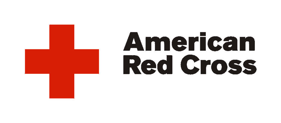
3. Cross
The cross is strongly influenced by cultural interpretation and usually associated with Christianity as soon as the lower beam is longer than the rest. Beams with even length are far less complicated. As plus symbol it could stand for added value. However, using it in red or green easily brings up associations with the Red Cross or pharmacies.
4. Lines
Mostly lines are used as frame, hatching or underlining. More interesting, however, is their use in the creation of larger shapes. The Wella logo is a good example of this practise.
![]()
5. Arrows
The orientation of an arrow influences its meaning. To avoid suggesting a particular direction logo designers often use more than one arrow in a design.
![]()